by Dane Miller
This is an analysis of the causalities from the Syrian Civil War between 2011-2018. The data can be found on (http://www.vdc-sy.info/index.php/en/martyrs) or Data.World. Looking over this dataset is very depressing to take in how many people have lost their lives in the past 6 1/2 years.
Note that the Violations Documentation Center in Syria (http://www.vdc-sy.info/index.php/en/martyrs) are likely under reporting the total number causalities. According to NPR (https://www.pbs.org/wgbh/frontline/article/a-staggering-new-death-toll-for-syrias-war-470000/) that total causalities are reported at 470,000 individuals. The Human Right Watch (https://www.hrw.org/world-report/2017/country-chapters/syria) reports 470,000 causalities as well. Another website (http://www.iamsyria.org/death-tolls.html) reports causalities closer to 500,000 individuals.
This analysis is looking at how the Violations Documentation Center in Syria is under reporting causalities. There is a terrible Human Rights tragedy happening in Syria.
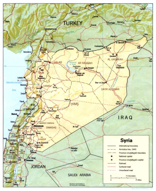
Map of Syria with its largest cities for context.
This dataset is an csv file 20.2 MB containing 211,910 rows of data. I will provide a link to my github page.
import pandas as pd
import numpy as np
import matplotlib.pyplot as plt
from mpl_toolkits.mplot3d import axes3d
import seaborn as sns

from sklearn.preprocessing import scale
import sklearn.linear_model as skl_lm
from sklearn.metrics import mean_squared_error, r2_score
import statsmodels.api as sm
import statsmodels.formula.api as smf

%matplotlib inline
plt.style.use('seaborn-white')
df = pd.read_csv('/.../Syria.csv') # add your location for your file in ...
Missing data

sns.heatmap(df.isnull(),yticklabels=False,cbar=False,cmap='viridis')
Number of causalities by gender and age class. The vast majority of individuals who have died have been adult males during the 6 year conflict.

sns.set_style('whitegrid')
sns.countplot(x='gender',data=df,palette='rainbow')
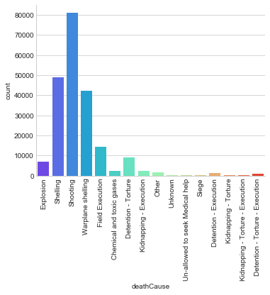
The vast majority of causalities in this data set individuals died by shootings, shellings, or warplane shelling.
g = sns.factorplot("deathCause", data=df, aspect=1.5, kind="count", palette='rainbow')
g.set_xticklabels(rotation=90)
Number of total causalities by province in Syria. Aleppo and Damascus suburbs have had the highest number of causalities.

g = sns.factorplot("province", data=df, aspect=1.5, kind="count", palette='rainbow')
g.set_xticklabels(rotation=90)
The number of civilian causalities were 3 times as many as non-civilian. Majority of deaths have been civilians in populated and suburban environments.

g = sns.factorplot("status", data=df, aspect=1.5, kind="count", palette='rainbow')
g.set_xticklabels(rotation=90)

fig = plt.figure(figsize=(20,14))
fig.suptitle('Syria Death Toll', fontsize=20)

g = sns.factorplot(x='province', hue='gender', data=df, aspect=4.0, kind="count", palette='rainbow')
g.set_xticklabels(rotation=90)
This figure looks at the causalities by cause of death by gender/age.
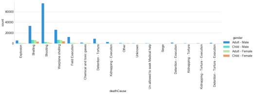
fig = plt.figure(figsize=(15,10))
fig.suptitle('Syria Death Toll', fontsize=20)

g = sns.factorplot(x='deathCause', hue='gender', data=df, aspect=4.0, kind="count", palette='rainbow')
g.set_xticklabels(rotation=90)
This looks at the cause of death by province in Syria.
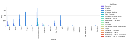
fig = plt.figure(figsize=(50,45))
fig.suptitle('Syria Death Toll', fontsize=20)

g = sns.factorplot(x='province', hue='deathCause', data=df, aspect=4.0, kind="count", palette='rainbow')
g.set_xticklabels(rotation=90)
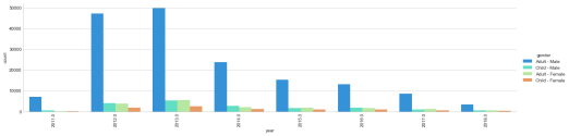
The number of causalities by year (2011-2018) by gender and age group. Even though the causalities have decreased, nearly 10,000 individuals are still dying per year. We are only four months into 2018, I really hope the causalities do not increase.
This figure compares the cause of death by year during the Syrian Civil War. In 2012 and 2013 the vast number of causalities were from shellings and shootings. Since 2013, there has been an increase use of chemical weapons.

fig = plt.figure(figsize=(20,14))
fig.suptitle('Syria Death Toll', fontsize=20)

g = sns.factorplot(x='year', hue='deathCause', data=df, aspect=4.0, kind="count", palette='rainbow')
g.set_xticklabels(rotation=90)
This figure compares causalities by year at the major provinces in Syria.

fig = plt.figure(figsize=(20,14))
fig.suptitle('Syria Death Toll', fontsize=20)

g = sns.factorplot(x='year', hue='province', data=df, aspect=4.0, kind="count", palette='rainbow')
g.set_xticklabels(rotation=90)
Distribution of the number of causalities per year in Syria.

sns.distplot(df['year'].dropna(),kde=False,color='darkred',bins=50)
Cause of death sorted by the year.

g = sns.factorplot(x='deathCause', hue='year', data=df, aspect=4.0, kind="count", palette='rainbow')
g.set_xticklabels(rotation=90)
The cause of death by province during the Syrian Civil War.

g = sns.factorplot(x='deathCause', hue='province', data=df, aspect=4.0, kind="count", palette='rainbow')
g.set_xticklabels(rotation=90)
The number of causalities by gender and ages grouping by province. The vast majority of all causalities have been adult males. However, in Aleppo ~5000 child males have died during attacks since 2011.

g = sns.factorplot(x='province', hue='gender', data=df, aspect=4.0, kind="count", palette='rainbow')
g.set_xticklabels(rotation=90)
Variables in the dataset:
Name – The reported name of the individual killed
Status – The individual’s status as a civilian or non-civilian
Gender- The individual’s gender and age category
Province – The province where death occurred
Birth place – The individual’s place of birth
Death data – The reported date when death occurred.
Death Cause – The category that best describes the proximate cause of death
Actor – The entity linked to the action which resulted in death
Year – (I added year into the data set in order to summarize the data).
Source of data:
Violations Documentation Center in Syria
http://www.vdc-sy.info/index.php/en/martyrs
Data.World
https://data.world/polymathic/casualties-of-the-syrian-civil-war/workspace/data-dictionary


